The brief
The campaign “Gode hverdagsvaner” was born out of the idea of making a collaboration between 365discount and Hjerteforeningen. Hjerteforeningen is an organisation that promotes living a healthier life, educating about heart diseases and holds a huge database of healthy recipes.
The collaboration is given, as 365discount wants to be the “green” discountchain and help their customers picking the healthier choice - food and items that are not as processed and organic vegetables.
The brief was to create a campaign across several medias; our newspaper first and foremost, and then email and SoMe.
The purpose of the campaign was to promote Hjerteforeningens healthy recipes, with a connection to price offers in our store. The second part of the brief was to expand the campaign to also include markers, that could help fight foodwaste.
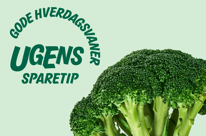
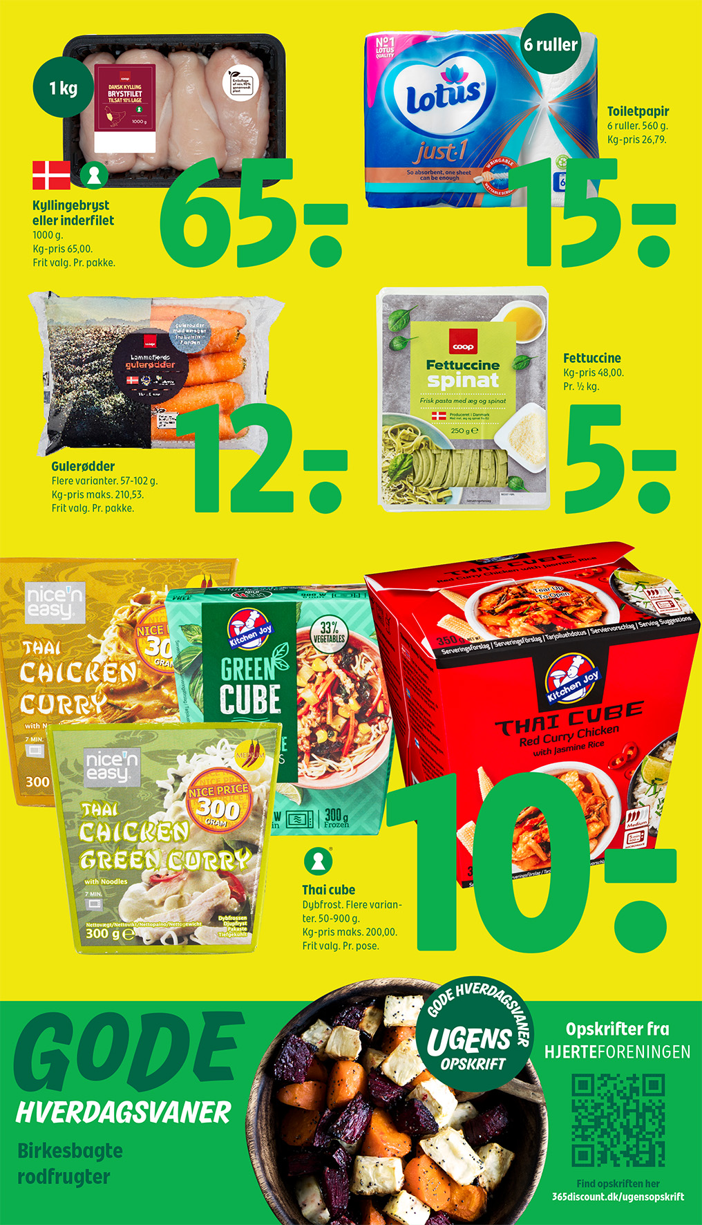
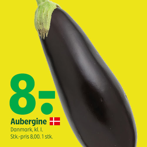
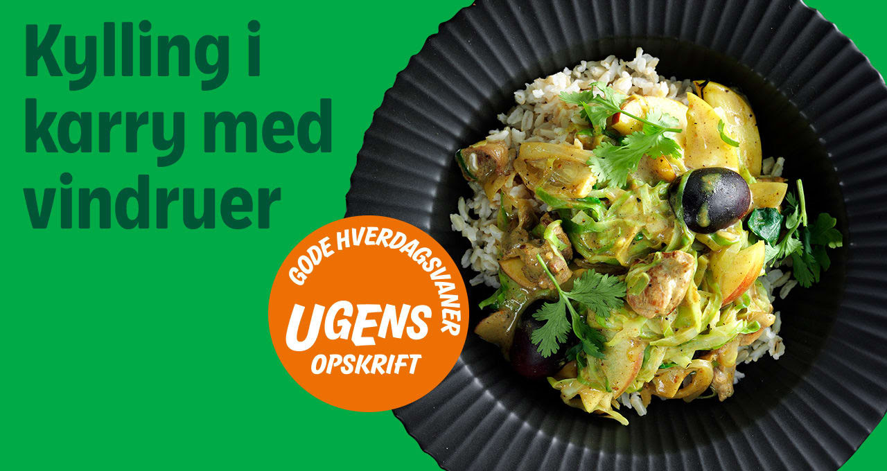
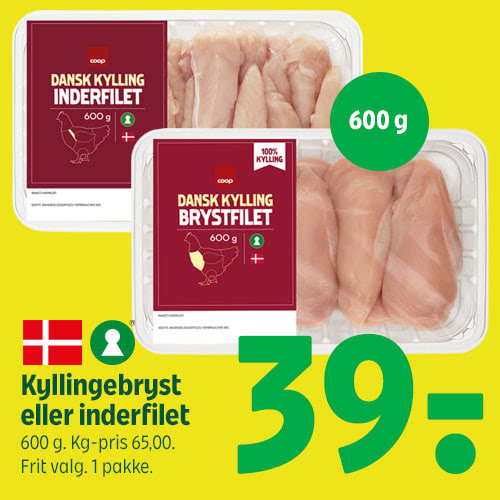
The solution was to create a campaign universe that would have a commercial angle; promoting items for sale that would be ingredients in the healthy recipes. The campaign universe would consist of a clear marker (splash), that could help promote a healthier choice. The marker would be accompanied by a picture of a curated dish, along with call-to-actions that is leading into the extensive recipe library that Hjerteforeningen has available.
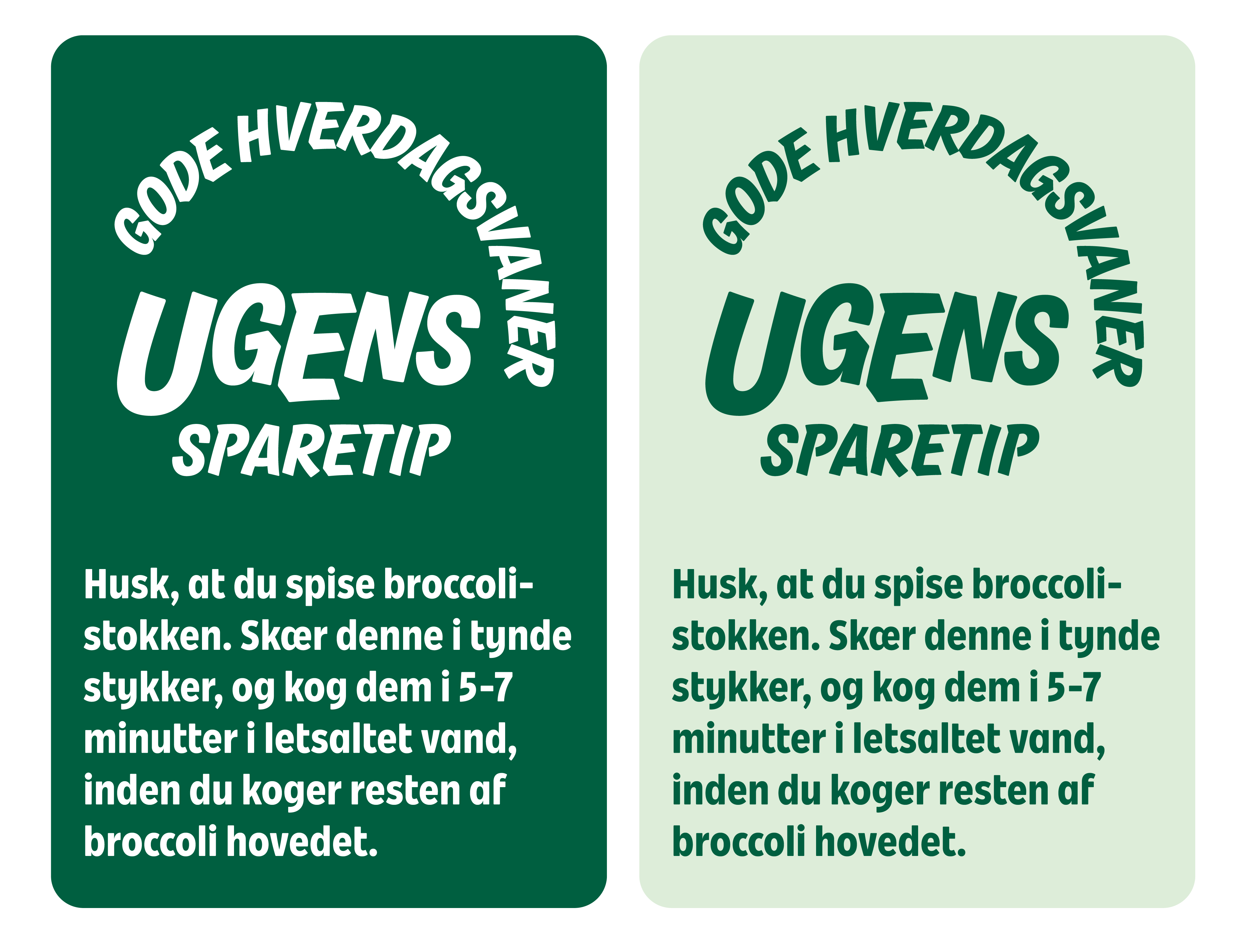
The second part of the brief is solved by creating an addition to the main campaign universe, by adding “Sparetips”. Sparetips has an agenda of promoting a more sustainable approach to selected items amongst the weekly priceoffers; this could be guiding the reader to also prepare and cook the stalk of the broccoli, or to stock up on small tupperware-containers to store and eat leftovers. This does not align with the idea of the commercial angle, but plays into the vision of being the green discountchain.
The campaign has been active for a total of 52 weeks (a year) with weekly creatives being produced for newspaper (print ad), ad for digital newspaper, section in newsletter (including price addition) and on the digital screens in the store.
First part of the brief; a splash
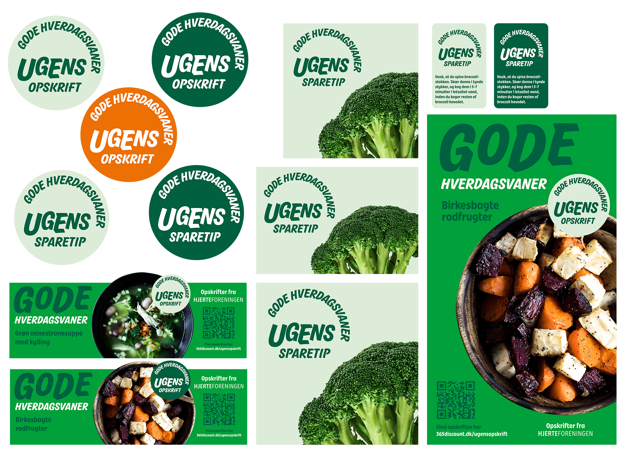
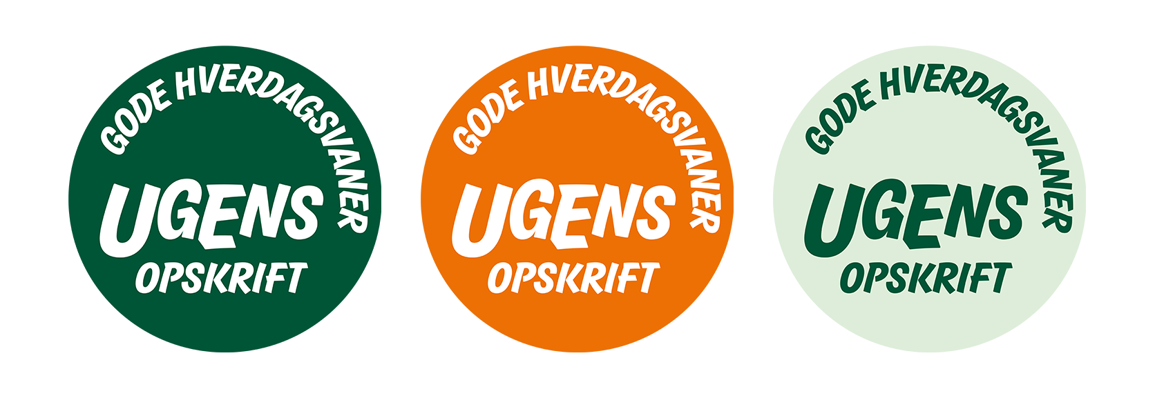
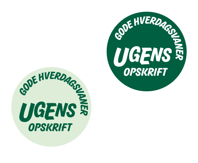
The key element in the campaign will be the following logo that is in three variations; dark, light and the orange one.
The logo is coherent to the 365discount brand visual identity, but takes a more playful approach to working with their custom made typography.
The playfulness also transcends into a variation of size on the different letters - which adds a happy and joyful vibe, something that hopefully manifests between the consumer and our brands.
I have worked with creating a optical balance in the logo, with heavier elements in the lower left corner, and smaller but more dense elements in the top right.
The idea behind the logo was to imitate a stamp - as a sign of approval.
The orange one was developed at a later stage, in order to increase attention to the splash, being that the page would contain different shades of green in the newspaper.
Smaller versions of the logo with increased tracking on the word “Ugens”,in order to be more legible in a tiny format in the newspaper.
Creatives enrolled in different formats
Newspaper ads


Newsletter elements with commercial angle (with orange splash)


Second part of the brief
The second part of the brief was to develop on the idea, and create a way to combat foodwaste. The idea was to use a variation of the splash with some distinct characteristics, in a visual that can expand dynamically depending on the amount of information presented.
![]()


Newsletter and SoMe elements